Craft a Memorable Visit for New York Transit Museum

Craft a Memorable Visit for New York Transit Museum

Craft a Memorable Visit for New York Transit Museum

Retain Visitor Attention Throughout the Entire Ticketing Process!

Retain Visitor Attention Throughout the Entire Ticketing Process!

Overview

The New York Transit Museum showcases decades of public transportation heritage

The New York Transit Museum showcases decades of public transportation heritage

However

However

Over 24% users exit the ticket booking process on it's website before even entering the date

Over 24% users exit the ticket booking process on it's website before even entering the date

How Might We

How Might We

streamline a enjoyable online ticketing process to reduce drop-offs ?

streamline a enjoyable online ticketing process to reduce drop-offs ?

?

Hypothesis

Hypothesis

It's not only about ticket purchasing, but the overall website experience.

It's not only about ticket purchasing, but the overall website experience.

Our Approach & Impact

Our Approach & Impact

Retain customer attention throughout each ticketing step!

Cut purchase time from 5 to 2 minutes

🤩

Introducing a fulfilling
ticketing journey

Introducing a fulfilling
ticketing journey

Qiuck Navigation

A concise submenu paired with highlighted recommendations for you.

Qiuck Navigation

A concise submenu paired with highlighted recommendations for you.

Fulfilling ticketing process

Swift checkout that emphasizes your contribution to public heritage and offers rewards.

Fulfilling ticketing process

Swift checkout that emphasizes your contribution to public heritage and offers rewards.

Tailored Recommendations

Whether you want something familiar or something new, we’ve got you covered.

Tailored Recommendations

Whether you want something familiar or something new, we’ve got you covered.

Client:

New York Transit Museum

Time line:

Feb. 2021 - May. 2021

My Role

UX Design, UX Research

Team Member:

Eleanor Cunningham-Rothwell, Shreedhar Verma and myself

Tools:

Optimal Workshop, Figma, Miro, Photoshop

My Contributions:

  • Lead design of website ticket purchase process for desktop and mobile version.


  • Develop the visual branding identity for New York Transit Museum


  • Collaborated with 2 designers in the entire user research and design process and prototyped navigation system for visiting experience.


  • Conduct 6 user interviews and recruit 8 participant in total for Card Sorting, Tree testing, and Usability Testing

Research

Research problems

Research problems

Why do customers drop the online ticketing process?

Why do customers drop the online ticketing process?

Insights

Insights

It's not only about ticket purchasing, but the overall website experience.

It's not only about ticket purchasing, but the overall website experience.

Observe user's needs

Users desire an easy and well-informed museum visiting experience

We conducted 10 user interviews with visitors at the NYTM and other museums to better understand the audience we are designing for. I contributed to 5 of these interviews.

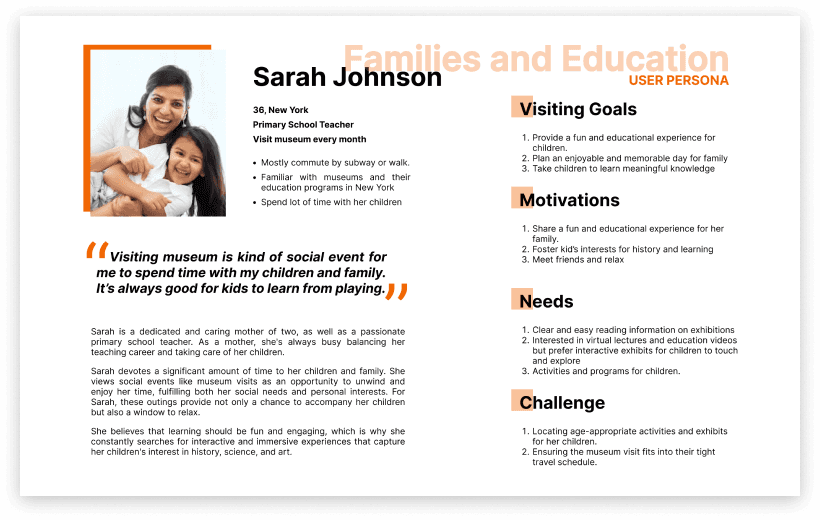
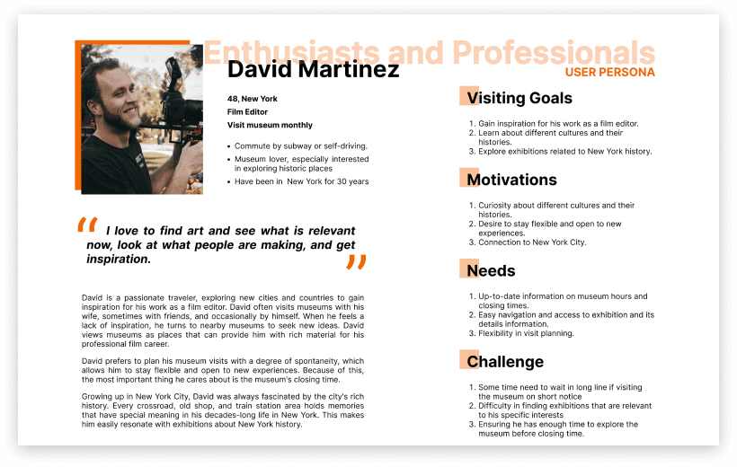
Based on interviews, we summaries 2 main visitor types for NYTM:

Families & Educator

Enthusiasts & Professnials

Families & Educator

Enthusiasts & Professnials

Following the affinity mapping, we identified and focus on 4 universal needs and 4 basic pain points that apply to all visitor types during visit planning:

Visitors hope to:

  • visit museum conveniently without many thinking


  • know the most recent opening hours and estimated time required for a visit


  • learn about current exhibitions and activities


  • discover exhibit details including pictures & reviews before a visit

Visitors frustrate with :

  • unclear structure of the website that difficult to navigate through


  • inadequate information of the exhibition that complicating visit planning.


  • text-heavy information that is difficult to scan and absorb


  • confusing and dense texts of ticket plans and membership

Learn from Competitors

The ticketing experience is connected to both user needs and business mode.

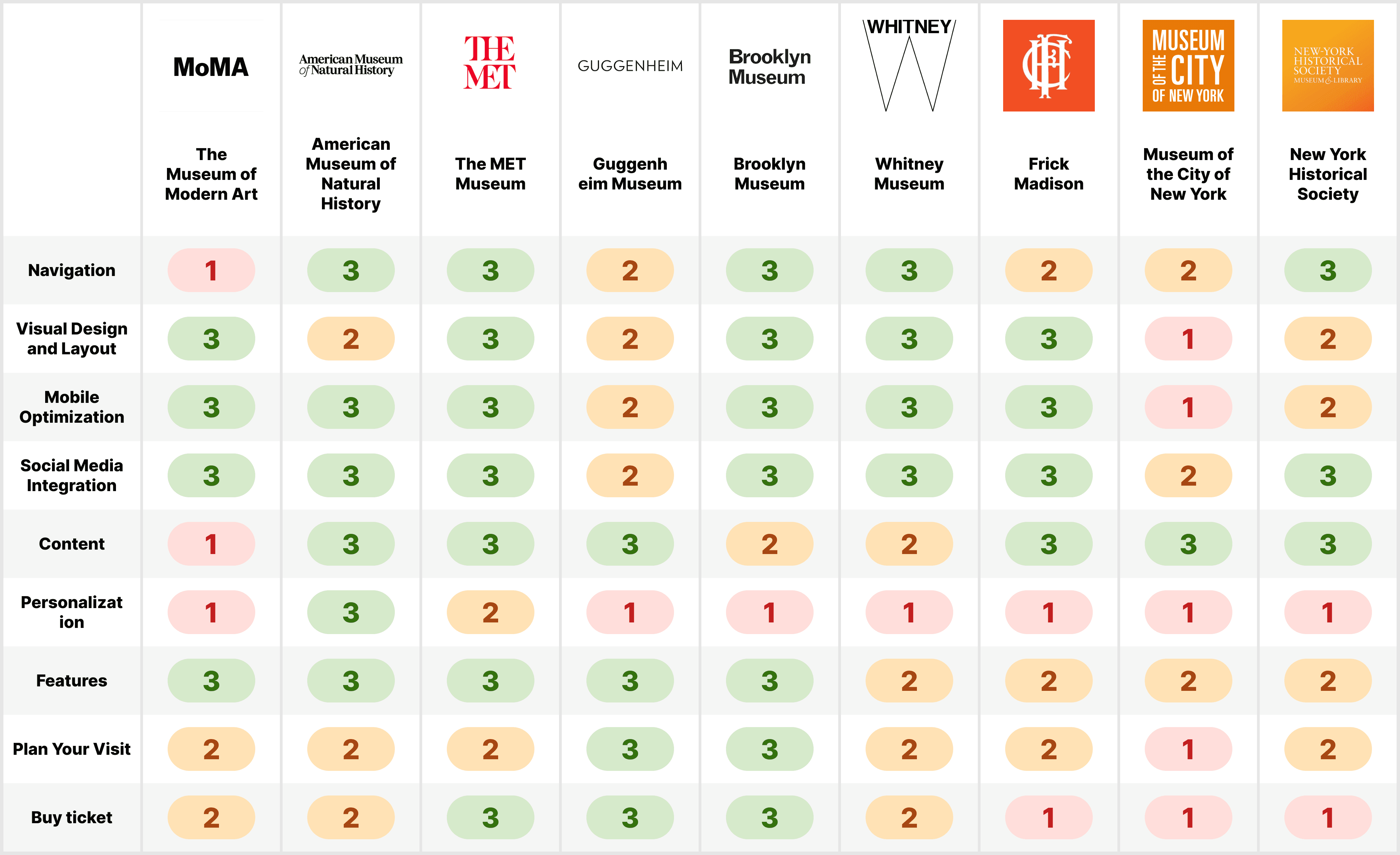
In order to attract visitors with engaging brand culture and provide a clearer information structure, We conducted a competitive analysis of 9 museum sites with similar visitor groups to streamline and reorganize the site's content, we rated each site on a three-level scale for 9 dimensions including from navigation design to ticket purchase.

Rainbow sheet analysis

We discovered that the design of a museum's ticketing experience is closely tied to its business model and brand identity. Museums with a wide variety of visitors and events, like The Met, tend to have complex ticketing systems. while museums with fewer types of users and exhibits, like the Frick Madison, have simpler checkout processes.


Drawing insights from competitors, we identified the 4 key aspects to implement and avoid for each page.

Coherent Visual Design

Concise Navigation

Accessible Content

Integrate Involvement

Implement

Consistent visual theme and design system for brand identity.

Succinct wording with clean and intuitive structure

Good balance of text and images with grids system.

Showcase user value to encourage clicking with call-to-cation.

Avoid

Avoid complex and unreadable color choices and text sizes

Avoid overloaded and repeated information

Avoid unintuitive framework and heavy texts.

Avoid leaving users without feedback

Design

Opportunity

Opportunity

How to drive business growth by crafting an enjoyable ticket booking journey?

How to drive business growth by crafting an enjoyable ticket booking journey?

Minimum Viable Product

Improve ticketing experience with 2 essential task flows

Our previous research indicated that, when booking tickets on our museum website, visitors mainly seek clear information about exhibit availability and a quick and easy reservation process. This lead us shaped our 2 MVP (minimum viable product):


1.Exploring exhibitions availability

2.Reserve the ticket for a chosen exhibition


With these key taskflows established, we embarked on our design and ideation phase. I lead the design of entire "Reserve Ticket" process.

2 essential task flow for booking tickets

Information Architecture

How can website's navigation structure help with ticketing reservation?

Integrating past research findings with NYTM's authentic website, we developed our first sitemap featuring 8 main categories that rooted in data analysis sourced from 6 card sorting interviews with 29 cards. ( View card sorting result ⇨)

Refined Design

Original Site

To gain a deeper understanding of users' mental model, we formulate 8 tasks and run 6 tree testing . Subsequently, we refined and crafted a final edition, which increased user success in finding the right pages from 56% to 80% during our follow-up tree testing. ( View tree testing result ⇨)

Brainstorm

Explore designs for a convenient visit.

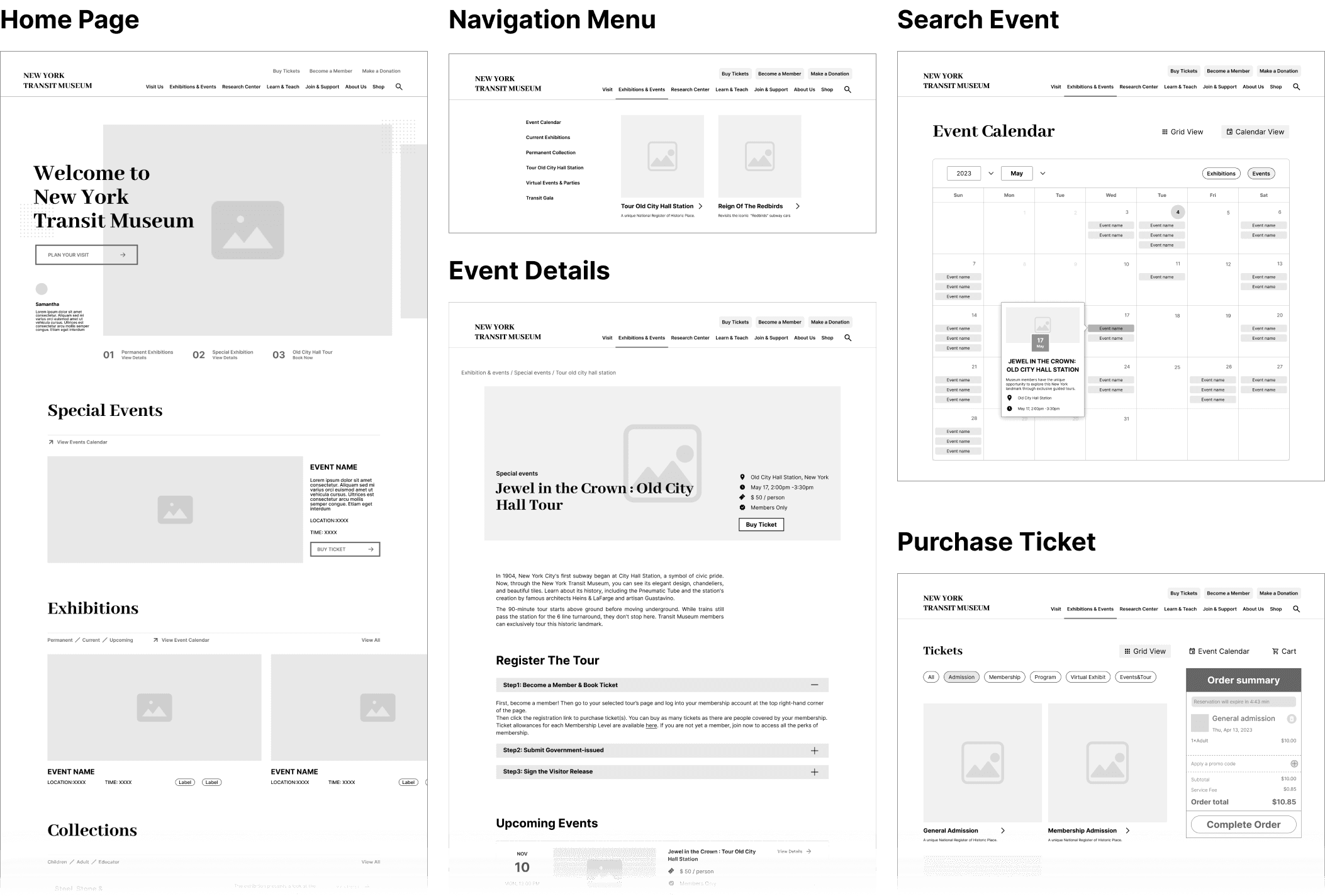
Countless Wireframes

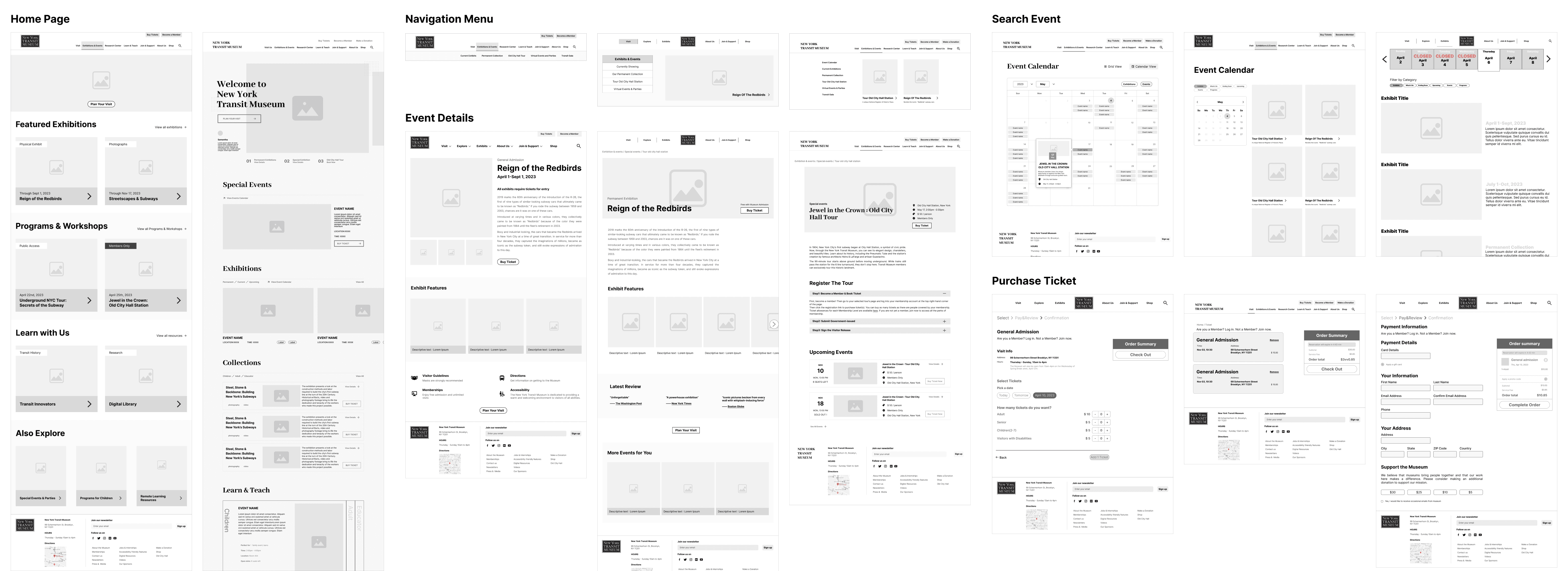
5 Key Pages

We brainstormed tones of different design concepts through wireframes sketching, mid-fi prototyping and tested with 5 users, from which we gather crucial feedbacks to guide our design decisions and enhance overall user experience.

Wireframe Exploration 😎

Wireframe Exploration 😎

Wireframe Exploration 😎

Wireframe Exploration 😎

The Winner ! 🥳

Test and iteration

Cut purchase time from 5 to 2 min!

We recruited 5 participants in total to test out the mid-fi prototype broken down into 8 tasks flows to iterate and analyze the usability of the model. Data shows our redesign decreased the mis clicked rate from 80% to 23%, and improve purchase efficiency form 5min to 2min.

Usability testing also pinpoint 3 aspects requiring additional polishing to deliver a comprehensive and user-friendly prototype.

Overall:

Design prototype additional interactions to make the experience more authentic and rename the Resources tab to avoid ambiguity

Desktop-Specific

Move the search bar to the top of the upcoming Events page for easier access

Mobile-Specific

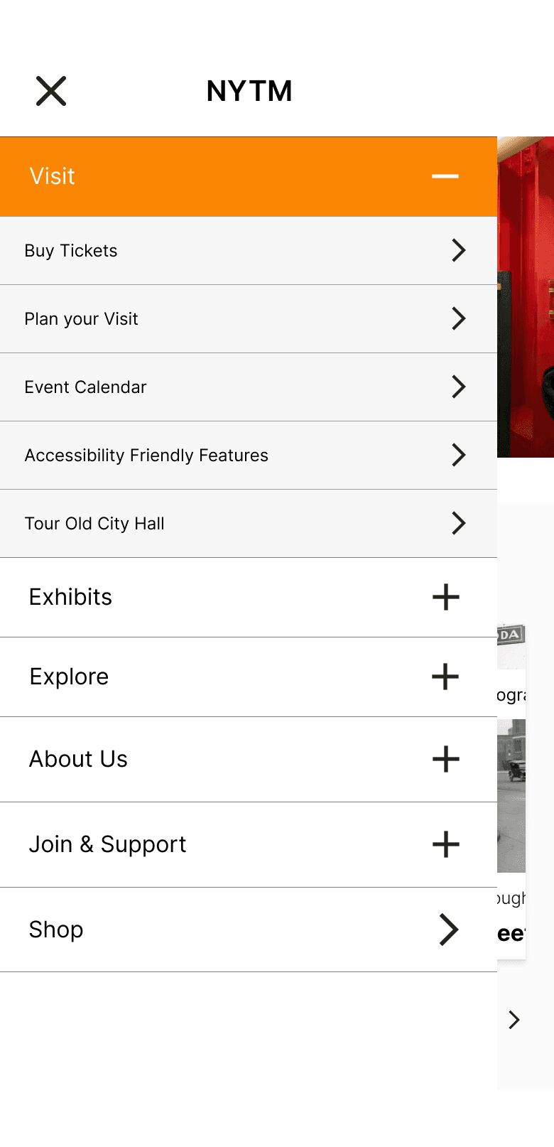
Add qdividers between each link in the mobile menu for better separation

Design Delivery

Craft a memorable journey that increase museum online ticket selling!


Craft a memorable journey that increase museum online ticket selling!


Visual branding

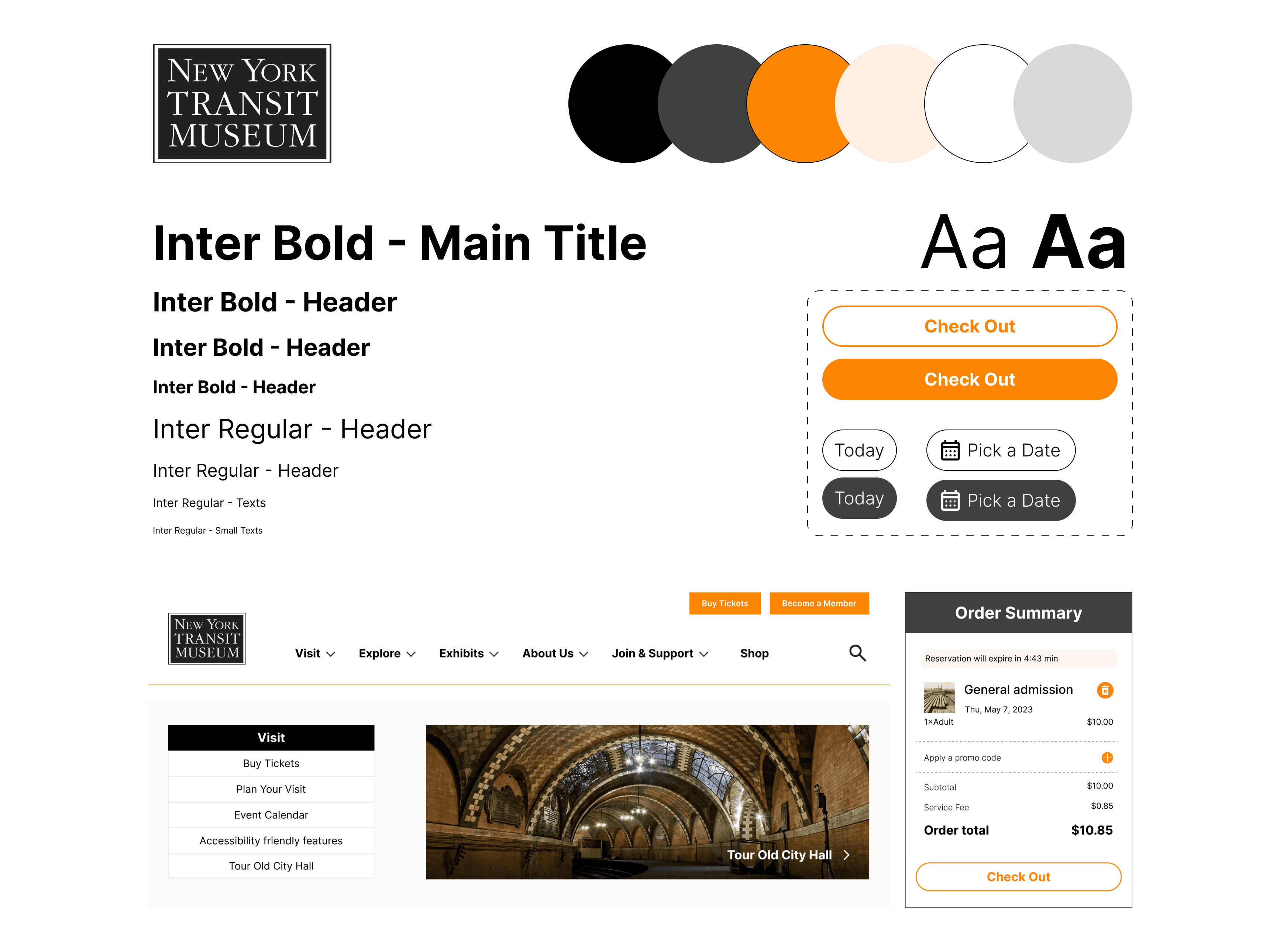
Refine design system based on the original branding

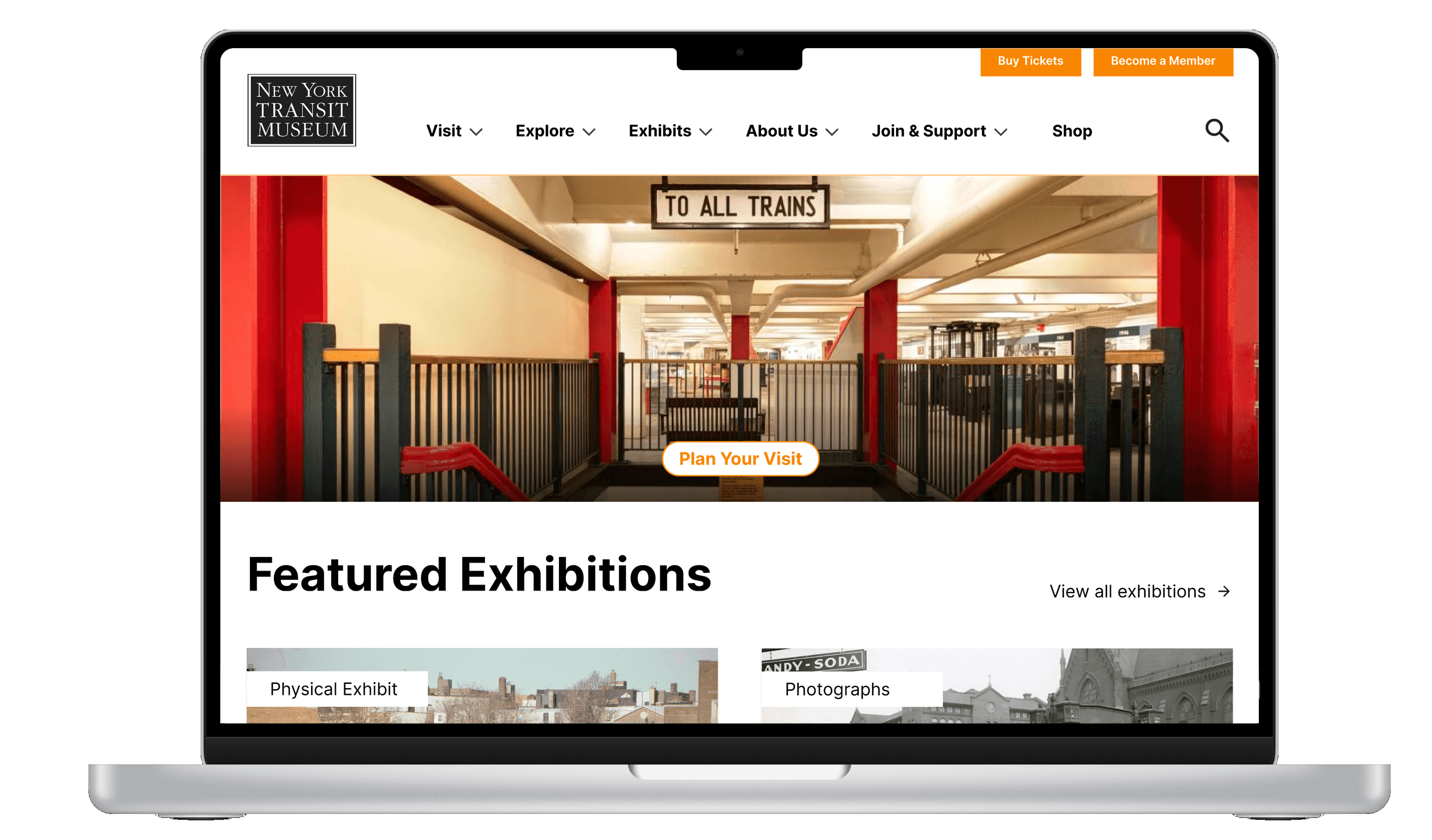
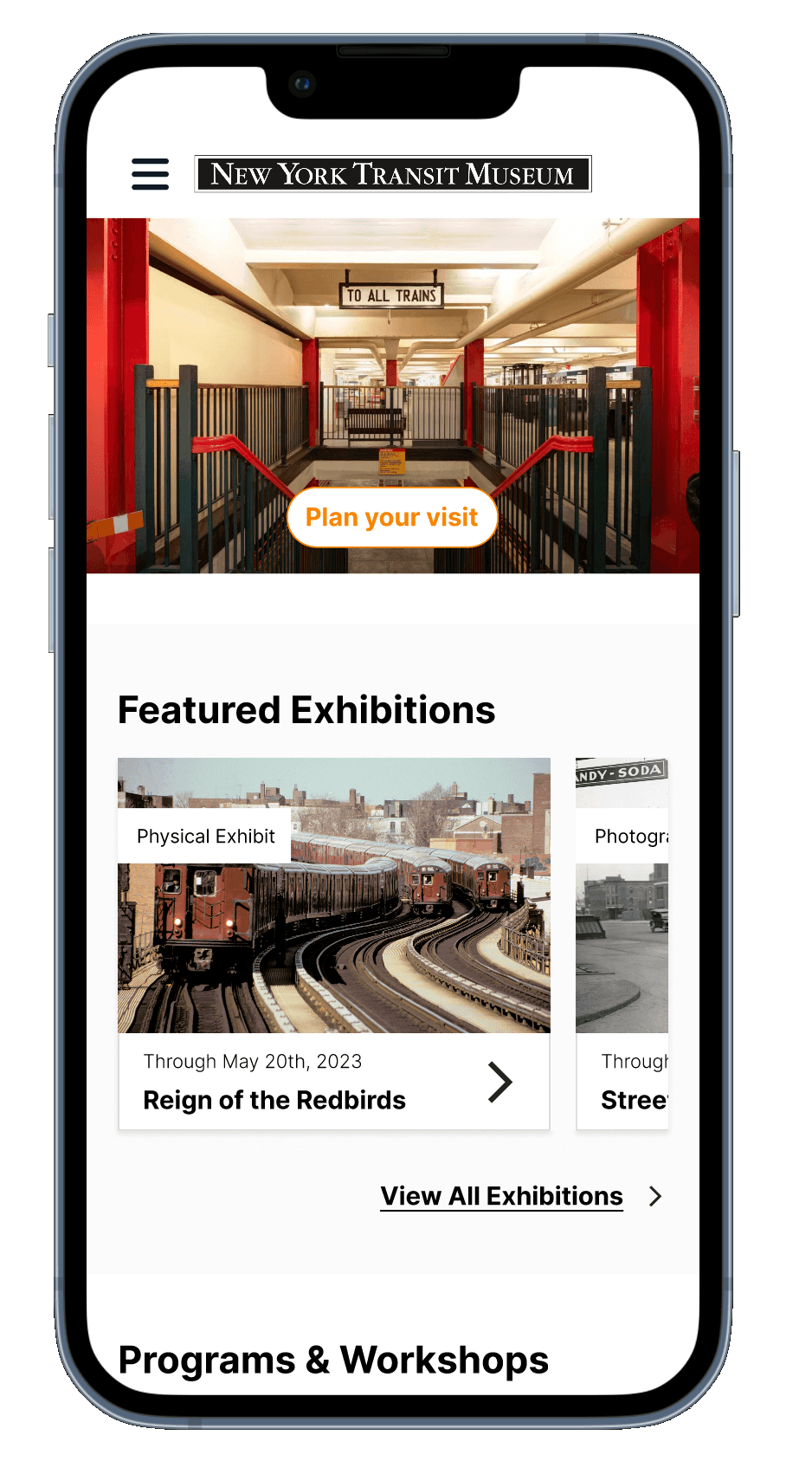
I lead my team in establishing a clear style guide and design system. We then refined the high fidelity mockup for responsive website design across desktop and mobile device, aiming to creating a cohesive experience with memorable brand identity.

Prototype

View our high fidelity protoype for desktop and mobile devices!

Design Decisions

Take a closer look for every destailed consideration

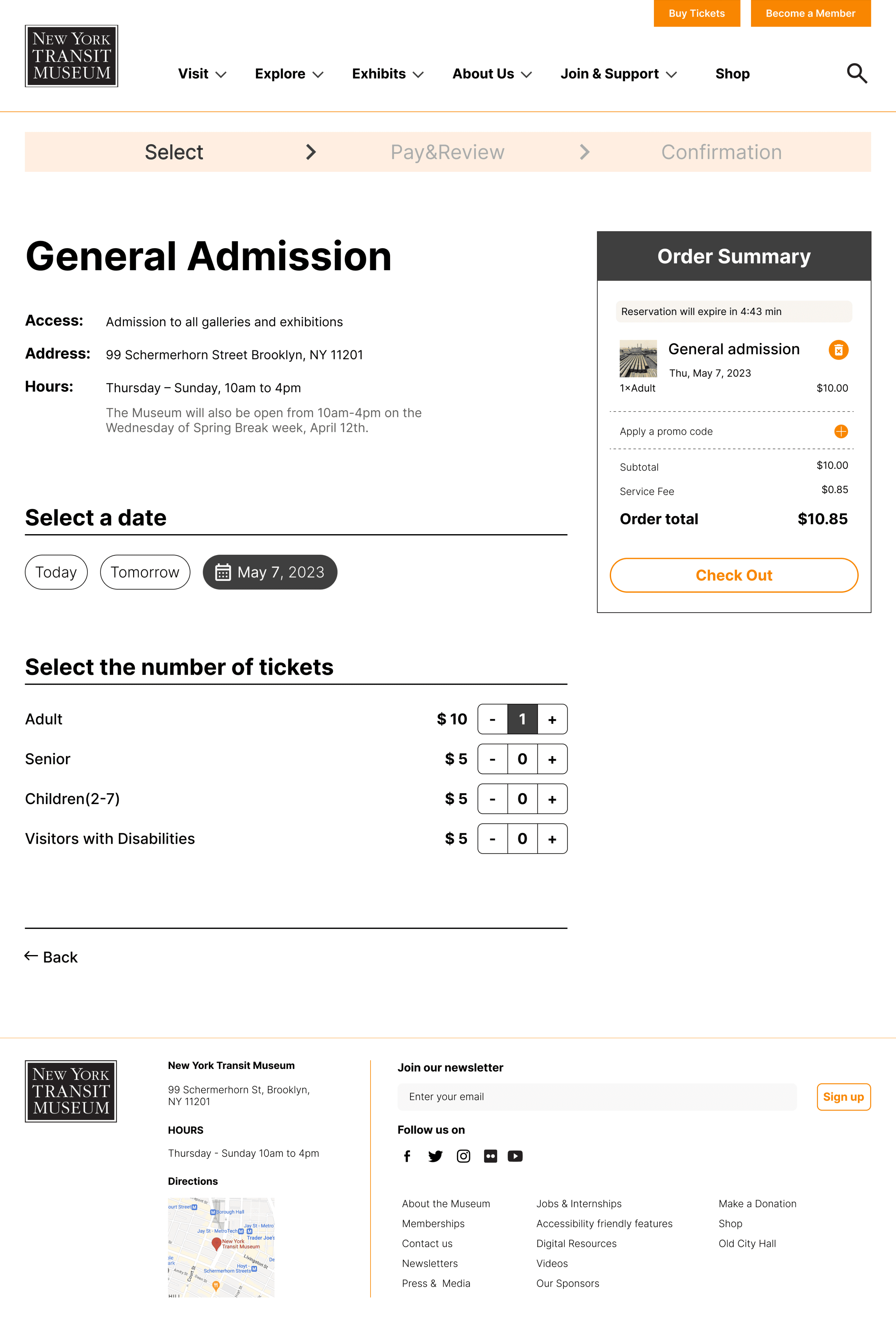
Feature 1: Buy Ticket

Facilitate a easier buying ticket experience

Lead by myself
Progress Bar:
Progress bar to help users know where they are in the process of purchasing a ticket and reassure them that their actions have been processed
Date Selectors:
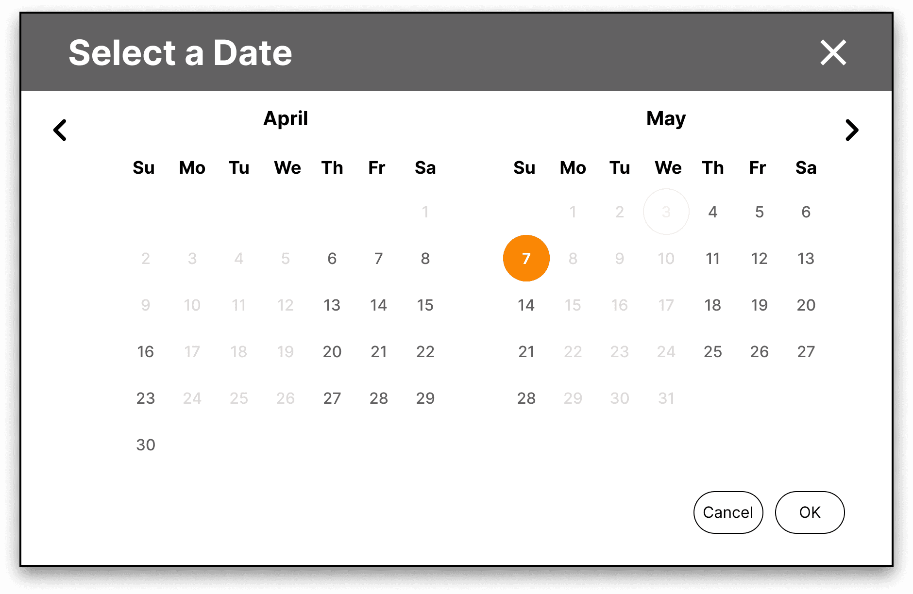
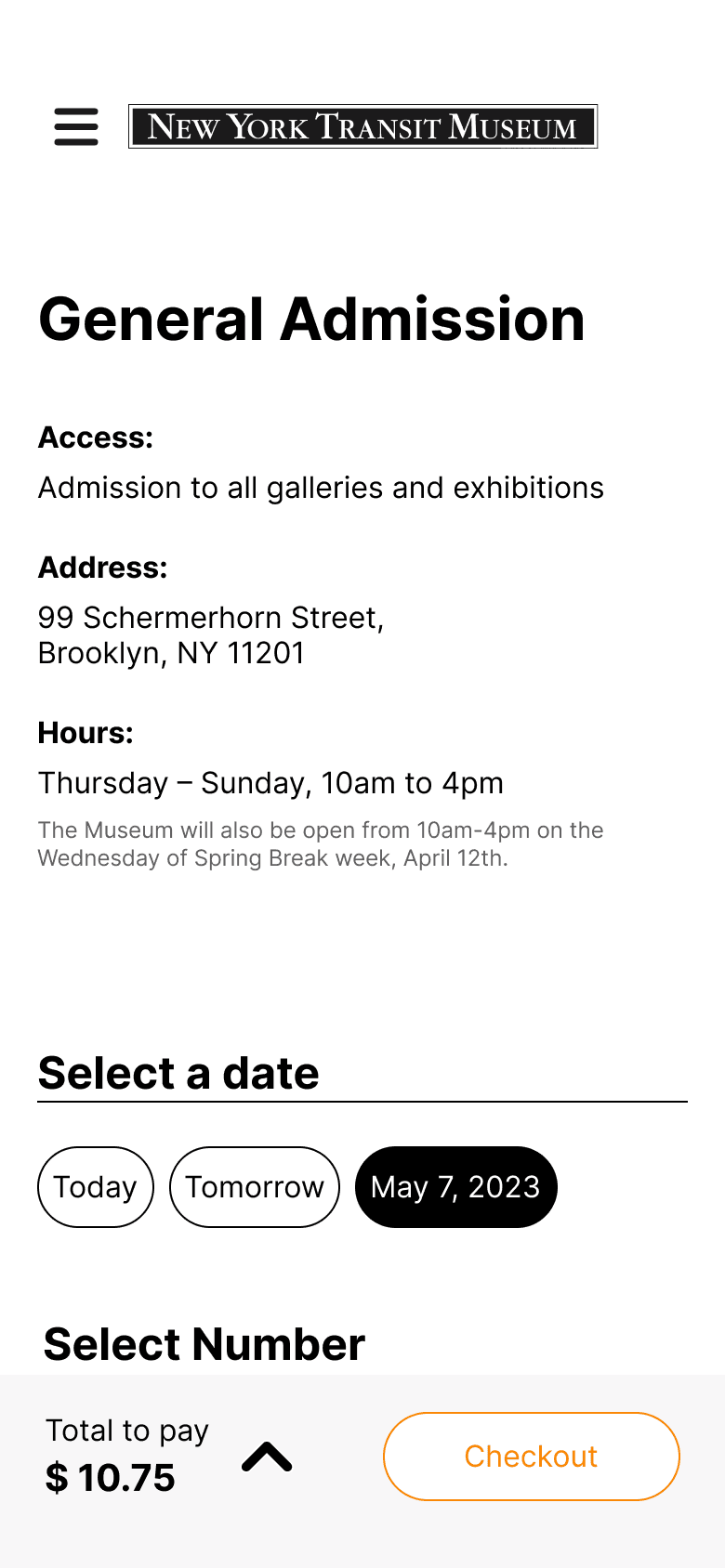
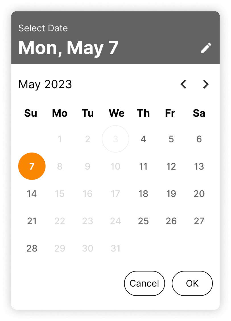
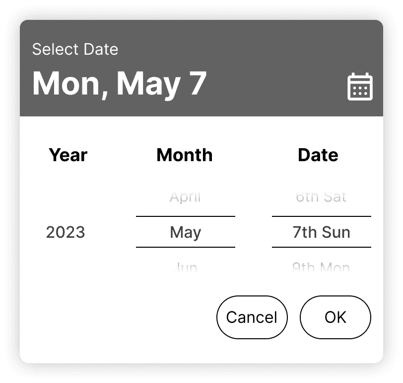
Our research showed that the majority of visitors interviewed plan Museum trips 1-2 days in advance, or the day of. So we prioritized options that focus on users being able to quickly pick dates that reflect this (today and tomorrow) while also giving the option to select from a calendar for those who are less sure of their schedule
Option to Select Date with Scrolling:
Provided additional option to scroll through dates to improve users ability to select dates on mobile
Quick Options to Pay:
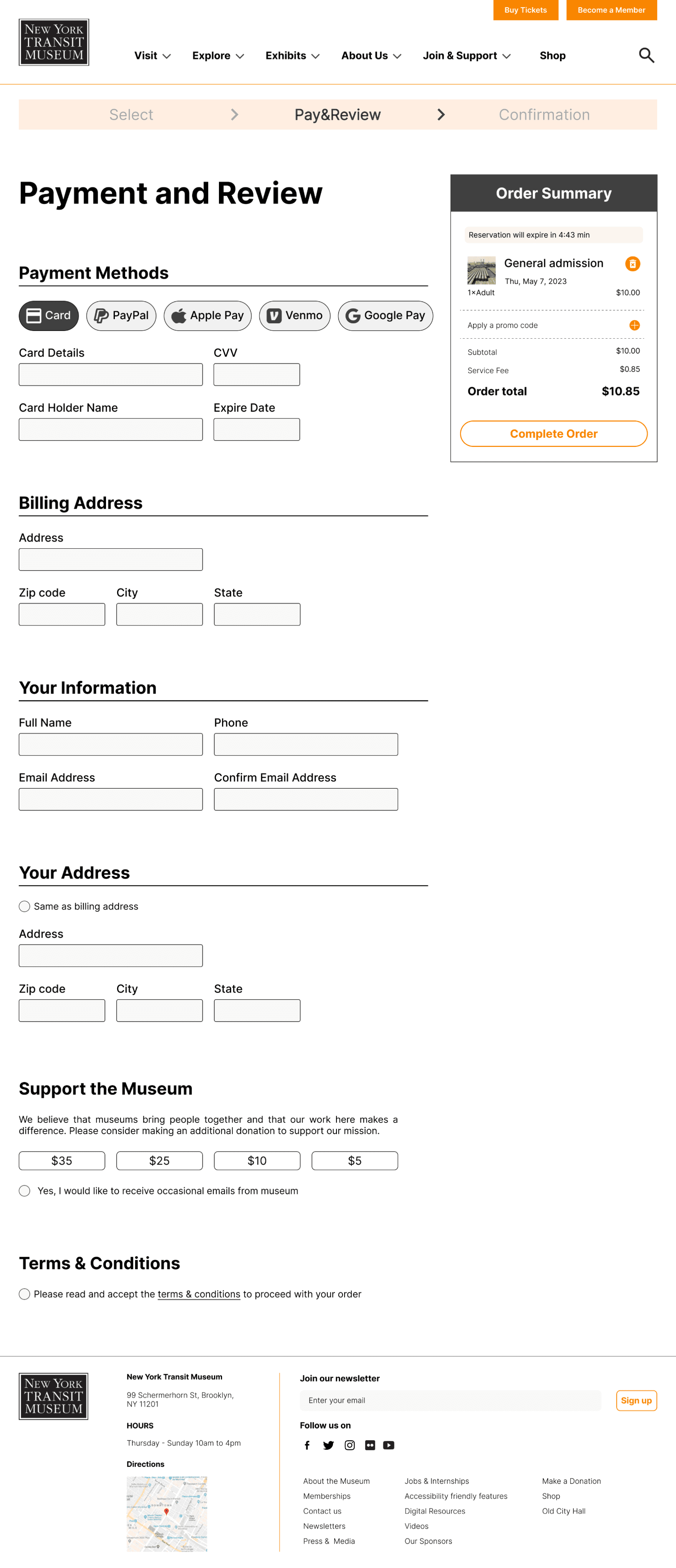
Prioritized pay options at the top of the checkout process to enable quick and easy payment selections for users when checking out
Museum Support Options:
Included buttons to add a donation to the Museum when buying a ticket to encourage supporting the Museum
Allow users to quickly review order:
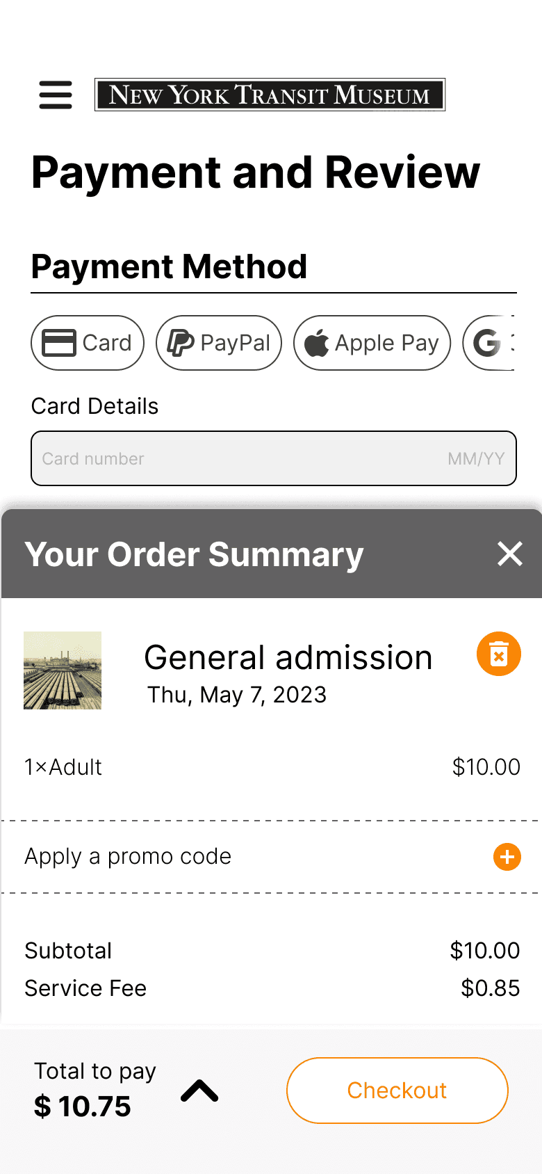
Order cost/details remains stuck throughout the entire purchasing process allowing users to quickly review their order and make changes if necessary
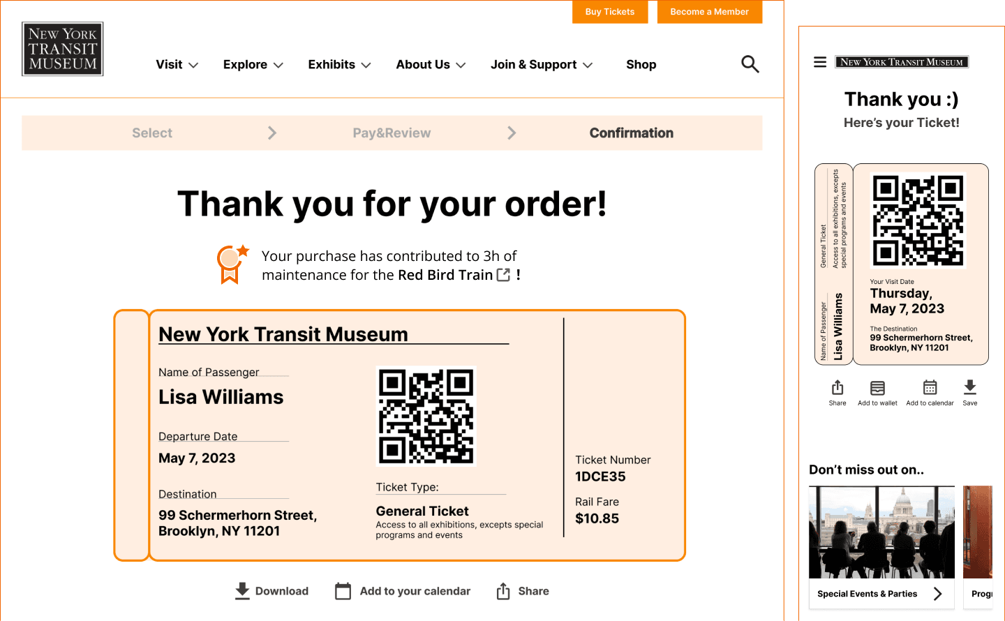
Ticket Design:
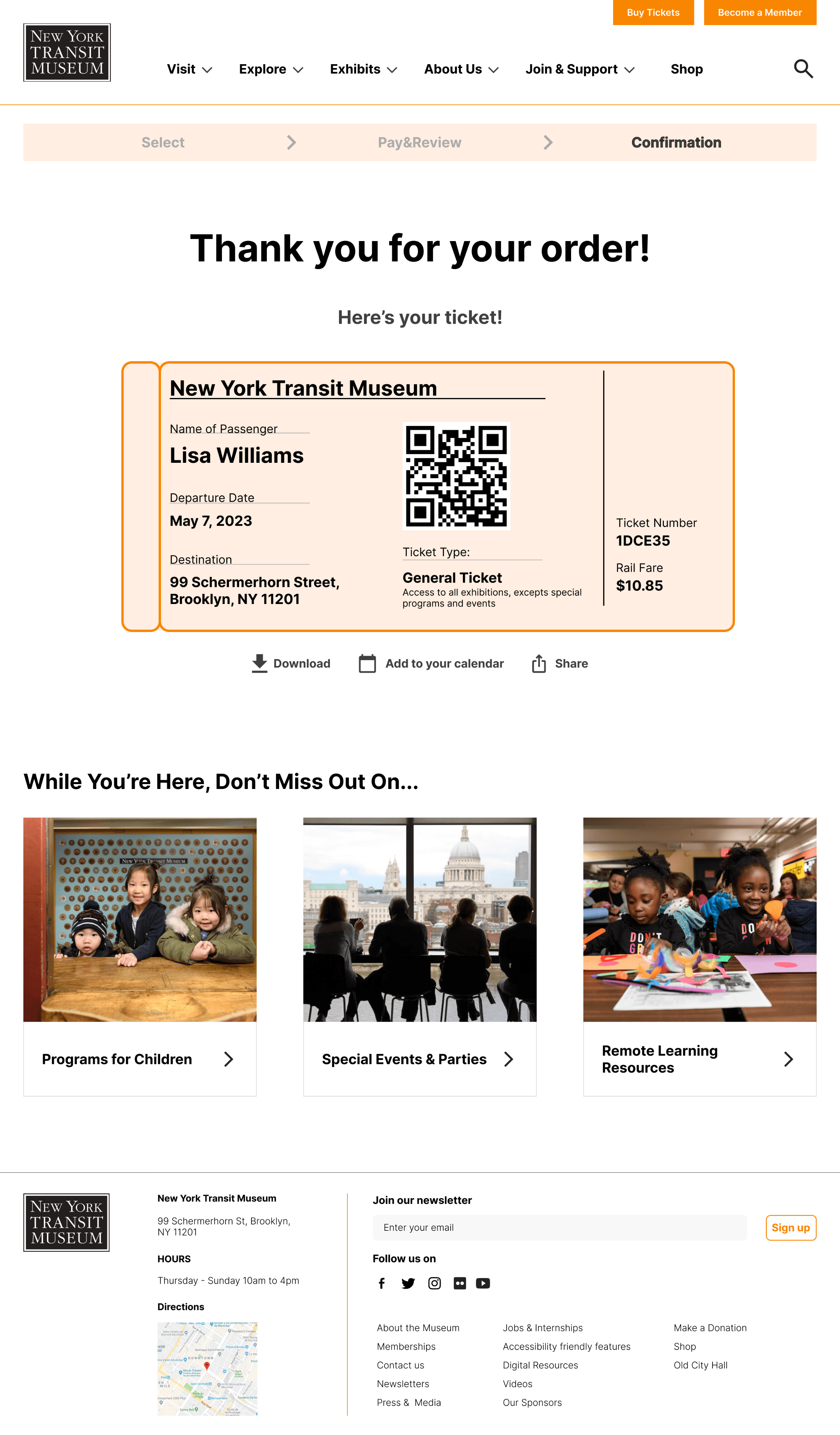
All users are presented with this ticket after purchase. The ticket was designed to look like a train ticket, take the chance for the museum branding identity

Competitive analysis of similar museums showed that many museum website designs did not contain any design elements that reflected the theme/premise of the museum and therefore provided a design opportunity for us
"Don't Miss Out On..." Links:
Included links to encourage users to explore after purchasing a ticket and further their journey within the Museum website. Maintaining the conversational tone established throughout the site.
Add to Wallet:
Concise version of train themed ticket appropriate for mobile viewingOption to quickly jump to relevant post-confirmation actions such as: sharing, adding to calendar etc.
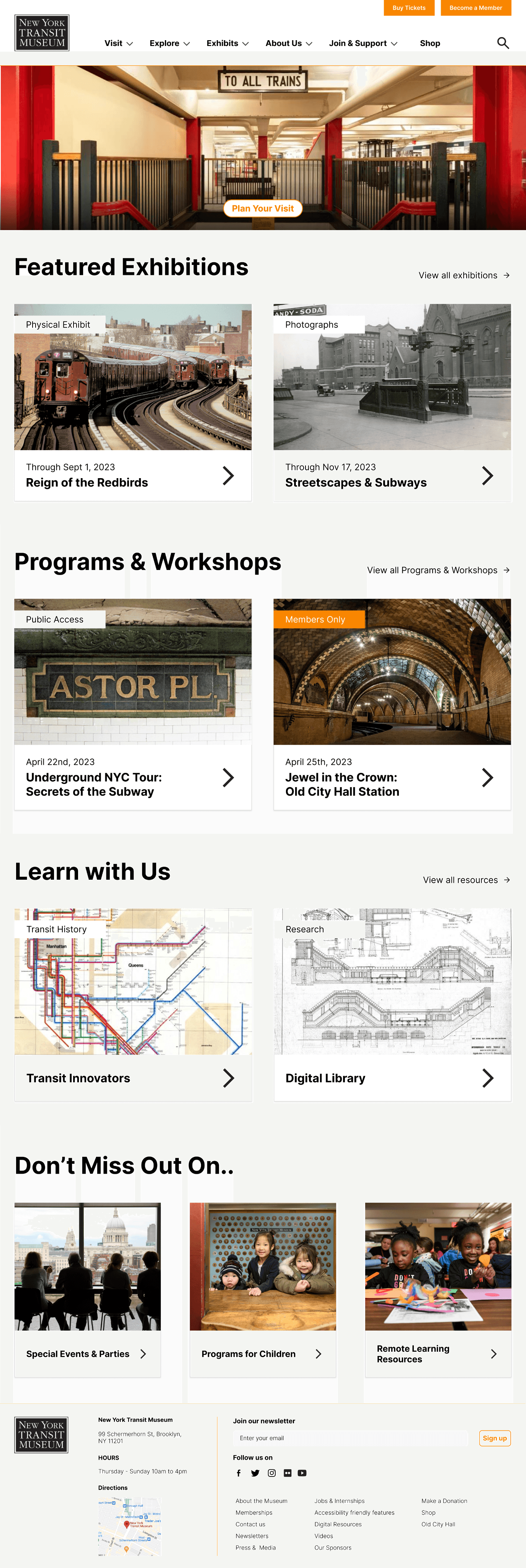
Tile Layout:
Our Research highlighted that users wanted to be up-to date with what all services/collections the museum offered.
A tile layout with scan-able information allows users to quickly browse through the content, while still keeping it engaging and informative
Information highlights:
Tiles contain relevant information about sub-pages to pique user interest and allow users to make decisions without visiting each page.

Our research also showed that users struggled to understand/relate to the exhibit and program names listed on the NYTM website. This information gives a better insight to everyday users about what the exhibit is about and what it contains.
Horizontal Scrolling:
Used horizontal scrolling for elements of same group to reduce the amount of vertical scrolling required by users.

Our research highlighted that users typically browsed through the mobile website to quickly go through what was currently on offer at the museum, so the home screen is designed to show high traffic areas with minimal scrolling required

Feature 2: Find Exhibits

Assist users in exploring desired exhibitions

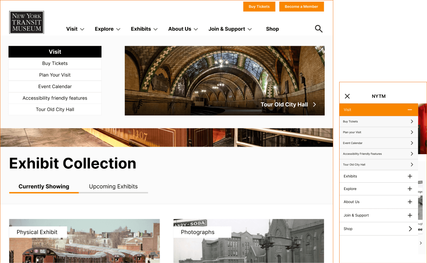
Drop down menu:
Styled the drop down menu to compliment the three layers of our site map. Images on the right provide balance for the text on the left.
This layout allows for added menu levels in place of the image if needed, effectively reducing all menu levels to one.
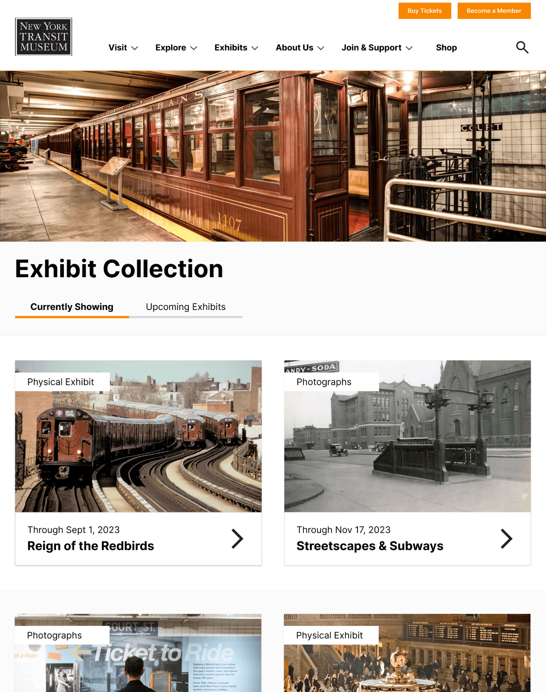
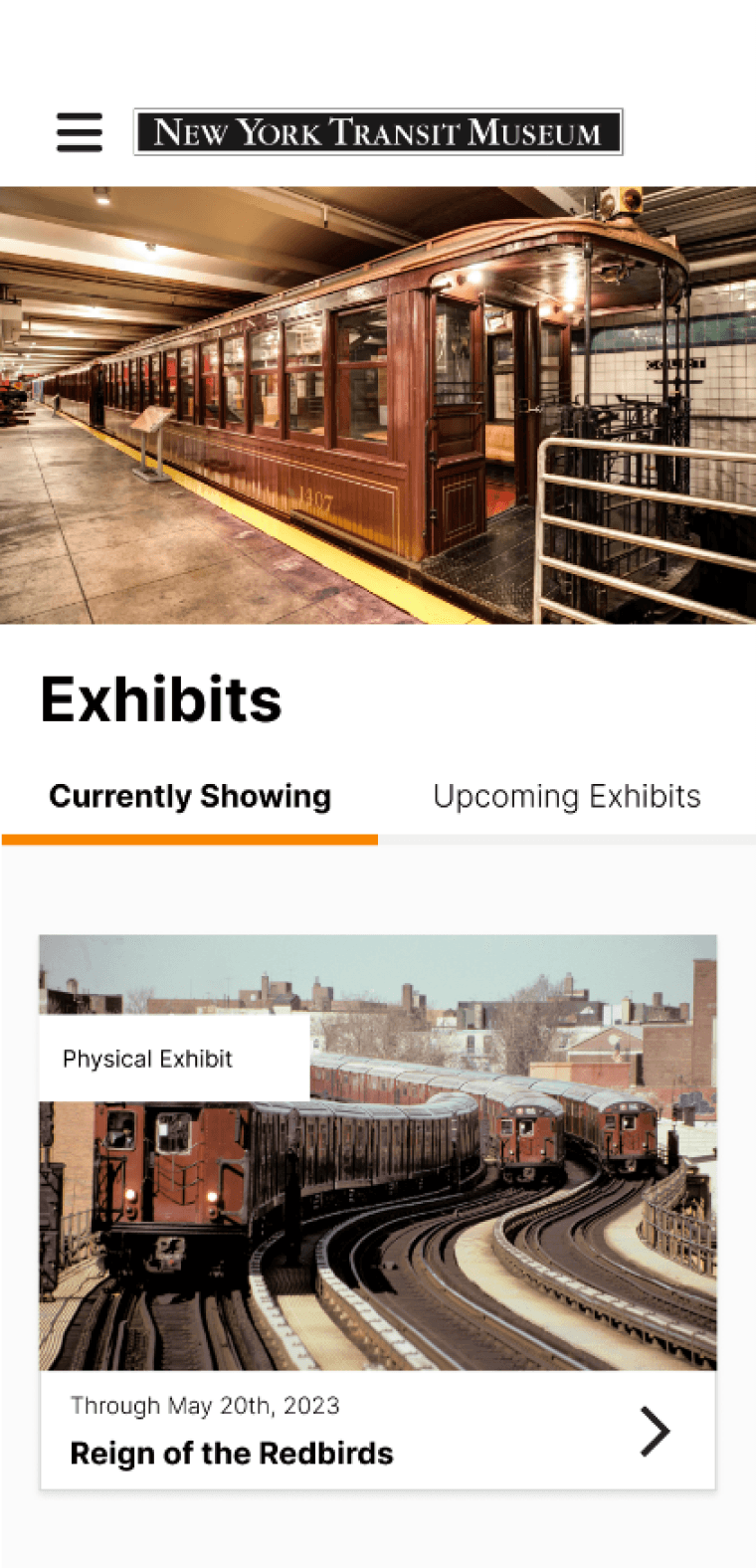
Currently showing/upcoming tabs:
Horizontal tabs allows users to quickly browse through collections. Our research highlighted that "currently showing" was the most common criteria while sorting through the collection and as a result is the default setting
Drop Down Menu:
Styled the drop down menu to compliment the three layers of our site map. Images on the right provide balance for the text on the left.
This layout allows for added menu levels in place of the image if needed, effectively reducing all menu levels to one.

Feature 3: Plan Visit

Support users planning their visit easily

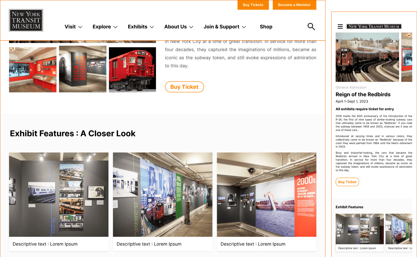
Grid Layout:
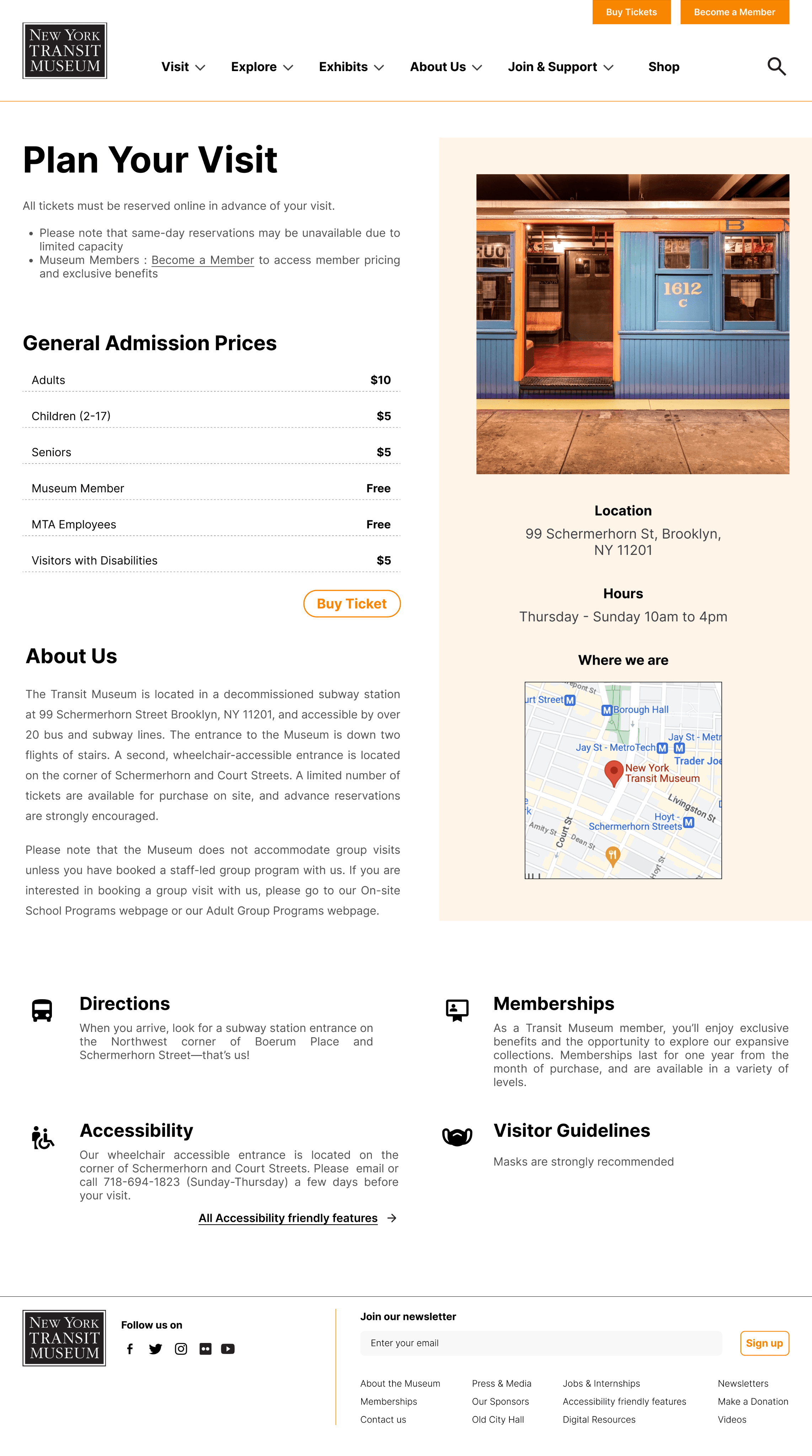
Placed information in sections with images and icons to make the amount of text easy to scan while also ensuring that we didn't cut down or hide text which provides key details for visit planning

Critical information placed in an easy to spot banner.
Utilizing Icons to Simplify Information:
We opted to use icons instead of heavy text to convey important information, streamlining the user experience and making the content more visually appealing and easy to understand. This approach allows users to quickly grasp the key points without feeling overwhelmed by excessive text.
Icons:
Used icons that represented corresponding text to help condense and convey information
Visual Layout:
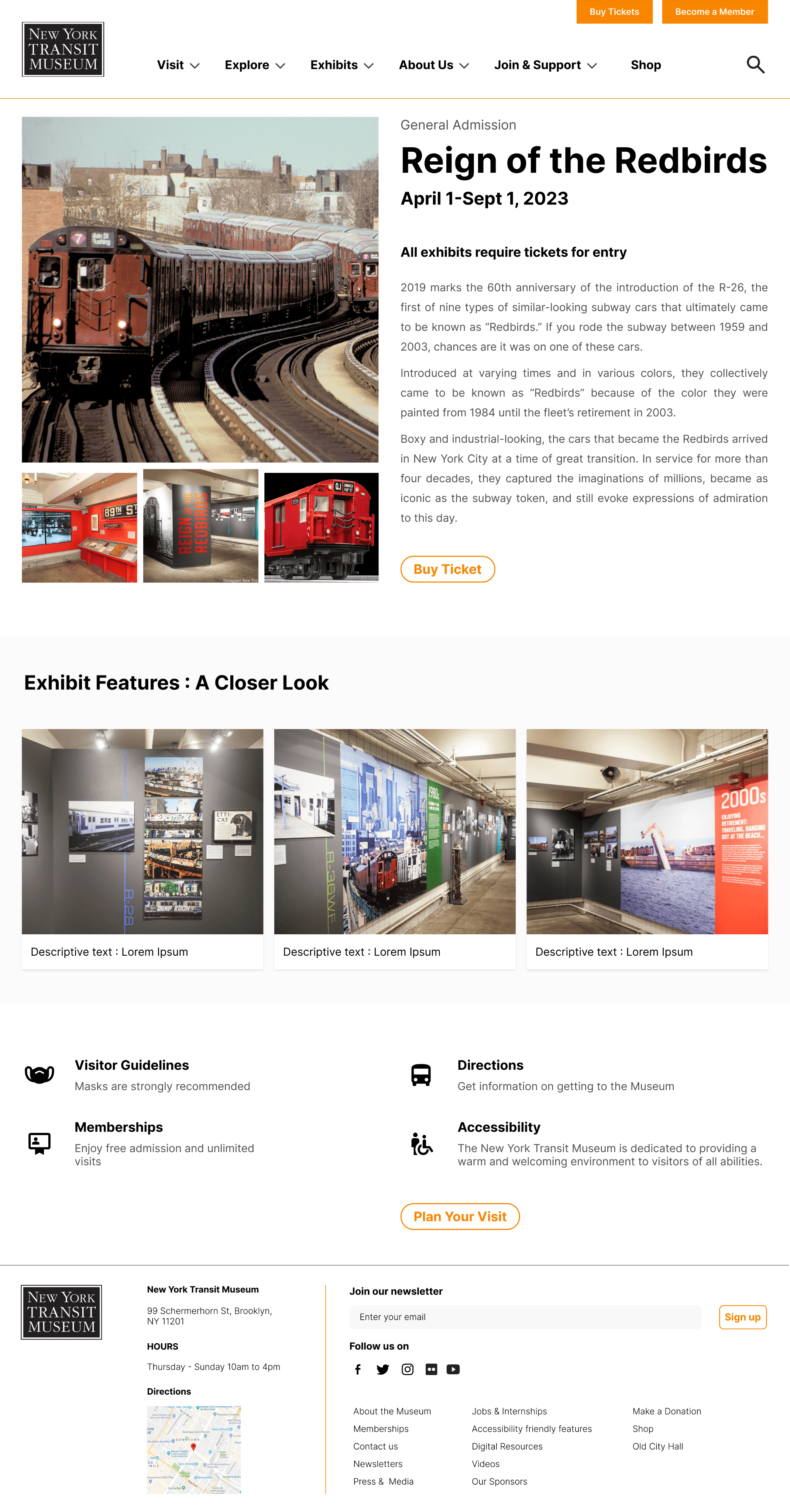
Equal use of image and text to convey information regarding a specific exhibit and make it easily digestible for a user who is often on the go.

Participants from our research stage mentioned that they would prefer to see images about the exhibit, rather than only a text description.
Exhibit Highlights:
Based on our research, users are interested in getting a glimpse of the exhibits and reading reviews before planning their visit. Therefore, we showcase feature images of the exhibits to provide visitors with a preview of what they can expect during their visit.
Horizontal Scrolling for Exhibit Features on Mobile Version:
We implemented horizontal scrolling for museum exhibit highlights on the mobile version, offering users a convenient and efficient way to browse and preview the exhibitions easily.

Looking forward

More iterations based on visitor's need!

More iterations based on visitor's need!

My learnings

Think in user's shoes and express as a designer

This was my first time working on a full-scale design project, and overall, it was an incredibly valuable experience for me. Conducting user research at the beginning of the project was particularly insightful, as it helped me better understand the priorities of our target audience. Analyzing similar websites was also beneficial in learning what aspects of UX design are effective and which are not.

My favorite part of the project was interviewing users in person, empathizing with their needs, and collaborating with teammates to discuss insights and brainstorm design solutions.

Futher Iteration

Iteration design choice with design mitrics

If I were to continue working on this project, I would be interested in understanding the museum's expectations for the web project and incorporating the client's needs while seeking a balance that benefits both users and clients. Additionally, I would definitely want to run usability tests on our high-fidelity prototypes to identify areas for improvement in the interface's usability and engage in an iterative design process.